So...the thought of hiring a graphic designer drives you crazy, but you need to figure out what typefaces to use for your brand identity. Typefaces add the emotion and individuality to what we say in print. If you're at the point of choosing fonts, you've hopefully already defined your brand personality. Your typeface will want to align with and evoke that personality.
Here's one simple (sort of) 5 step approach to selecting a typeface:
First, define your utilization.
2 basic uses for type:
a. headers and titles and slogans that are typically shorter, larger and convey lots of personality
b. body text that offers explanation or detail, and is usually smaller & may come in high volumes
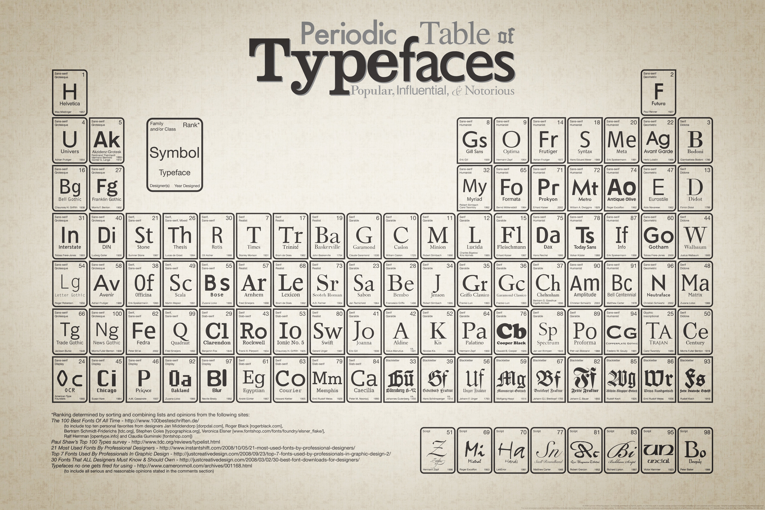
Second, define your category or classification of type. Here's one approach:
a. sans serif (straightforward, no squiggles, easy to read at small sizes, great for body text).
a1. Geometric (pure geometric forms, colder, more precise)
examples: Helvetica, Univers, Futura, Avante Garde, Akzidenz Grotesk, Franklin Gothic, Gotham
a2. Humanist (just enough subtle tuning to feel man-made instead of machine-generated)
examples: Gill Sans, Frutiger, Myriad, Optima, Verdana
b. serif (oozing personality, plenty of flourishes, most suited for headers/titles/slogans)
b1. Old Style (classic forms often referencing calligraphy)
examples: Jenson, Bembo, Palatino, Garamond
b2. Transitional and Modern (mid to late 1800s: sharper, more geometric)
examples: Times New Roman, Baskerville, Bodoni, Didot
b3. Slab (Simple forms wearing heavy shoes)
examples: Rockwell, Clarendon, Memphis
Third, find your typeface.
a. If your medium is primarily or exclusively electronic, and you are very concerned with retaining the integrity of your design when viewed by web browsers, consider restricting your typeface selection to websafe fonts: arial, comic sans, courier new, georgia, impact, palatino,
tahoma, times new roman, trebuchet ms, verdana
b. if you are comfortable with having some computers substitute other typefaces for those you select, or if you present everything design-sensitive as an image instead of as type, or if your medium is not primarily electronic, then consider the following approaches to selection:
1. If you are restricting your search to typefaces loaded on your computer, go to wordmark.it.
1a. Load your computer's typefaces into the program as instructed.
1b. Where it says "Wordmark", type in the title or phrase you want to use.
Below, you will see your phrase depicted in every typeface you have on your computer, ready for your selection. There are additional controls on the menu bar to modify appearances.
2. If a larger world of typeface possibilities are of interest, do a websearch for "fonts". There is a very large universe of foundries and markets for fonts you can purchase, and there is a very large field of free fonts not necessarily optimized for all uses or available for commercial use, but oozing with personality. Remember: define your brand personality, and stay aligned with it.
3. If you have seen a font and want to know what it is, go to http://www.myfonts.com/WhatTheFont/ and load the electronic image for identification.
Fourth, verify that your selection serves your purposes effectively:
a. Is the typeface available in the sizes you need?
b. Is the typeface available in the styles you need (italic, bold, condensed etc.)?
c. Does the typeface offer all of the characters that you need (ligatures for example)?
d. Does the typeface support the alphabets and languages you need (letters, diacritics)?
e. Does the typeface read fluidly and comfortably if you are using it for body text?
f. Does the typeface align with your brand personality if used for title text?
Fifth, contact us. It's optional of course, but we're happy to share our thoughts, and we might just save you from yourself. Go to the Contact page on the website.
For another take on selecting typefaces, try http://julianhansen.com/. Julian has a neat flowchart for sale that leads you through a decision tree to a typeface selection. Still cheaper than hiring a designer!