case histories

case history: a year in bhutan by roel krabbendam

case history: a year in bhutan

Invited to Bhutan to imagine a new retreat, we suddenly realize we have a lot to offer international projects. We have Dutch and American passports that allow us to travel almost everywhere, we have extensive and very diverse experience as architects and interior designers, we have powerful and completely portable software on our laptops that allows us to set up shop anywhere there's power, and we regularly tie into powerful tools and storage in the cloud whenever we have internet access. Plus, travel completely lights us up: intellectually, emotionally, spiritually. We were in Bhutan after a rather exhausting itinerary just 5 days after first getting the invitation to discuss the project.

In Bhutan, we were impressed first by the mist and the clouds. They imbued everything with a mysterious quality that suggested we were lucky for every gorgeous view we were afforded. This sense of mystery pervaded the entire trip.

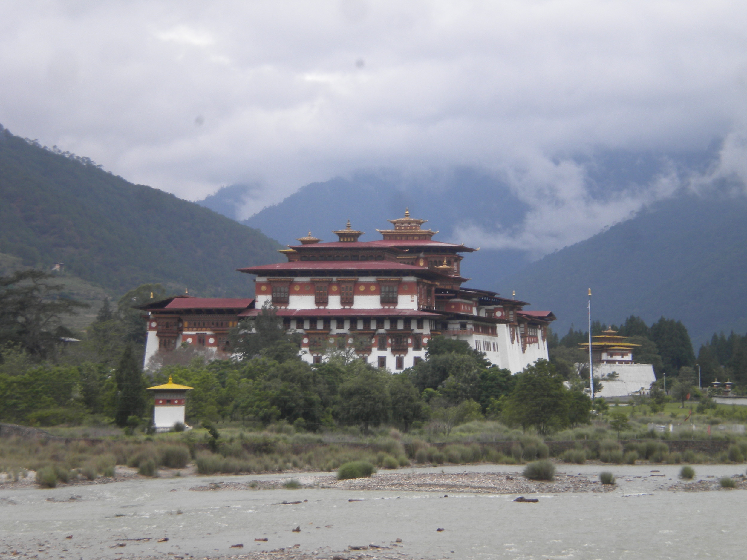
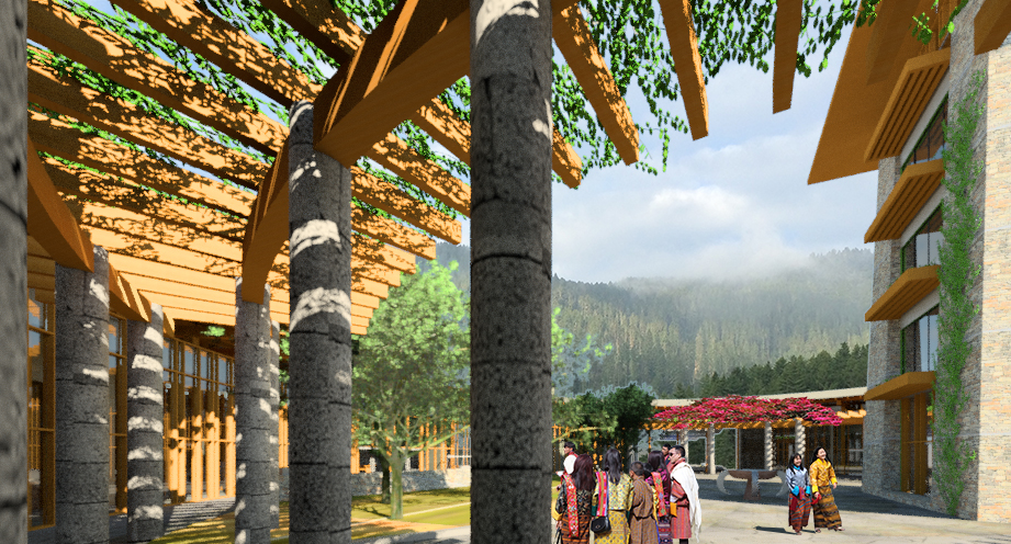
We were of course fascinated by the uniformity and power of the architecture, especially the Dzongs and Lahkangs of some centuries ago but also the little chortans and alters encountered by the roadside.

Finally, we were confronted with a very specific jurisdictional mandate: respect this country's culture and architecture in designing this new retreat. It was difficult to understand exactly what that meant. Would there be any space for exploration or conversation? Would we simply be shoehorning new uses into old forms? Would the marriage between western sensibilities and expectations and Bhutanese culture be a one-sided union?

Surprisingly, not at all.

The site was misty and remote and insulated by a magnificent and protected blue pine forest.

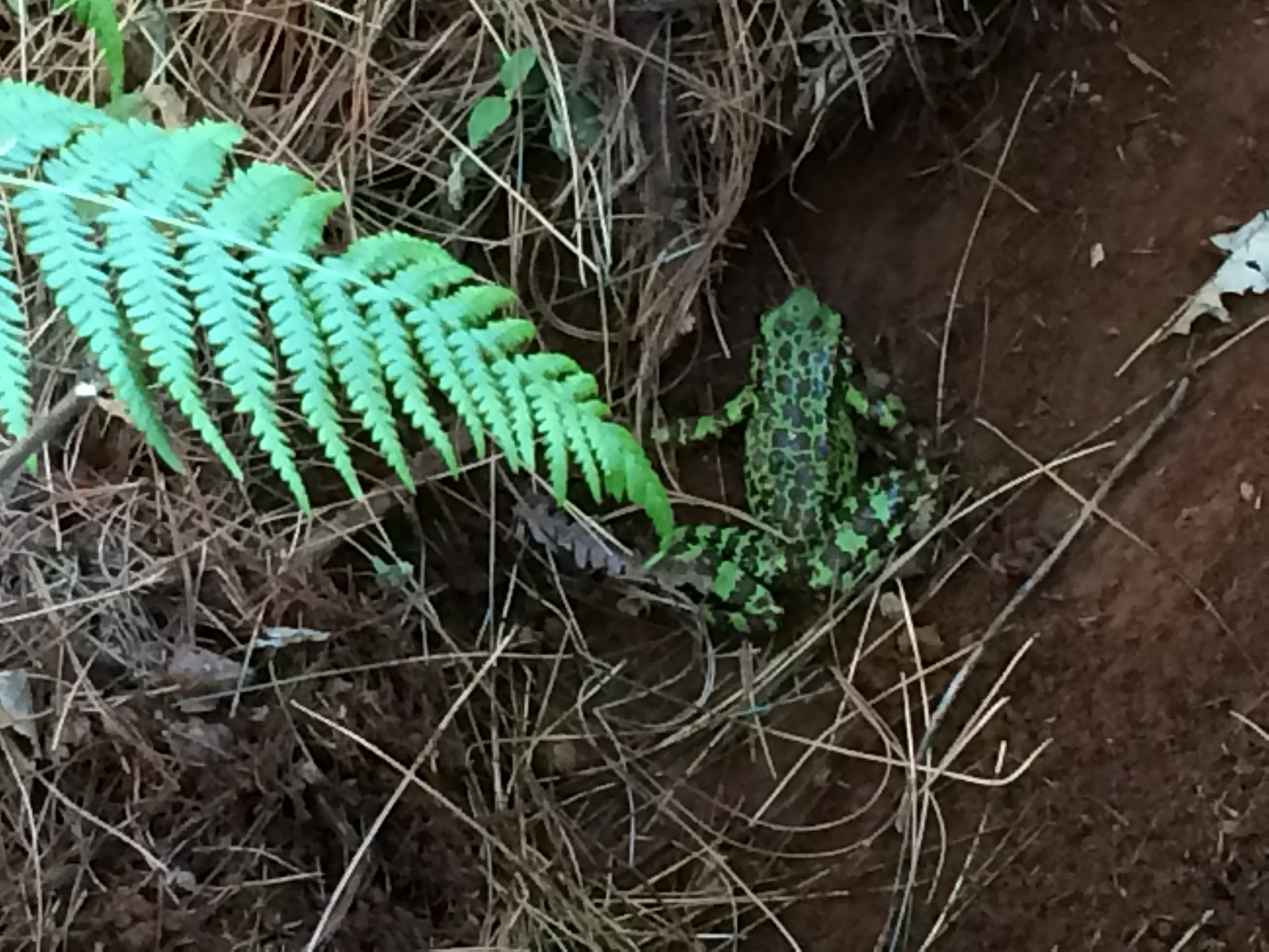
It was damaged from grazing and once hosted a buckwheat field. When we scratched the surface of the terrain we encountered little surprises: a frog, water, abandoned implements.

We started from one simple idea, that this project should offer exactly what drew visitors to Bhutan in the first place: mystery and discovery,  It should pique curiosity, and appeal to the adventurer. It should reward investigation with surprise and delight.

We brainstormed experiences that evoked these qualities, and they became points of reference. Lifting the cover of a new book. Opening a strange box. Walking along a curved wall. Stumbling on the unexpected. Entering a dark cave. Separating a Nesting Doll. Discovering something hidden. For example, in imagining the Villas that would hide in the trees we created a nesting doll, with a carved wooden enclosure inside a glass jewel box, and a stone chamber inside that wooden enclosure, and then not some dark dank cave of a chamber, but a beautifully sunlit room filled with glass jewels reflecting brightly so that the visitor experiences one kind of "enlightenment".

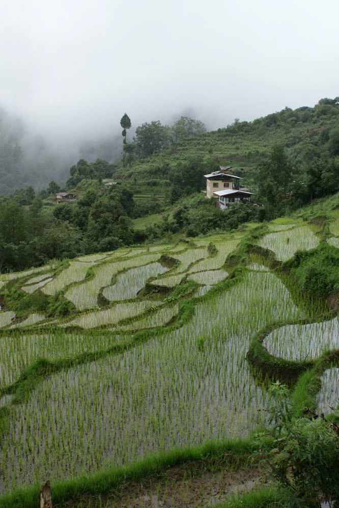
When it became clear that we would host a majority of the residences in the old buckwheat field, we thought to hide them under newly planted buckwheat in newly formed terraces, drawing our inspiration from the many rice paddies we had seen in the country.

We were warned that earth covered buildings would never earn Ministry approval, but we felt certain that it was appropriate here to build a garden and not a village. We felt too, that earth-covered dwellings would be a very useful tool in the jurisdictional planning toolbox.

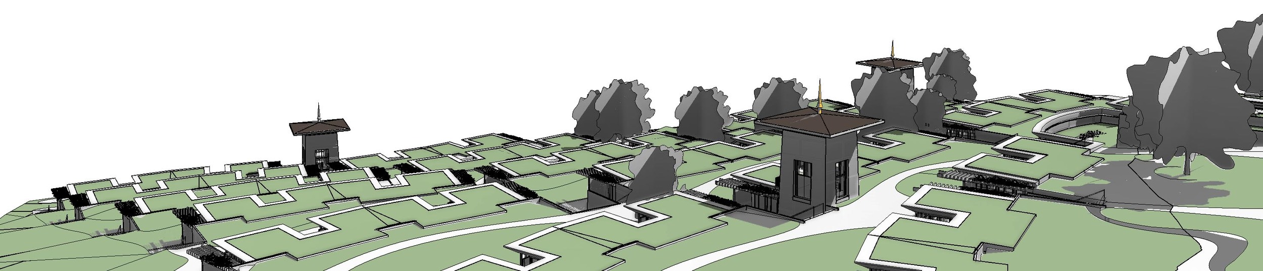
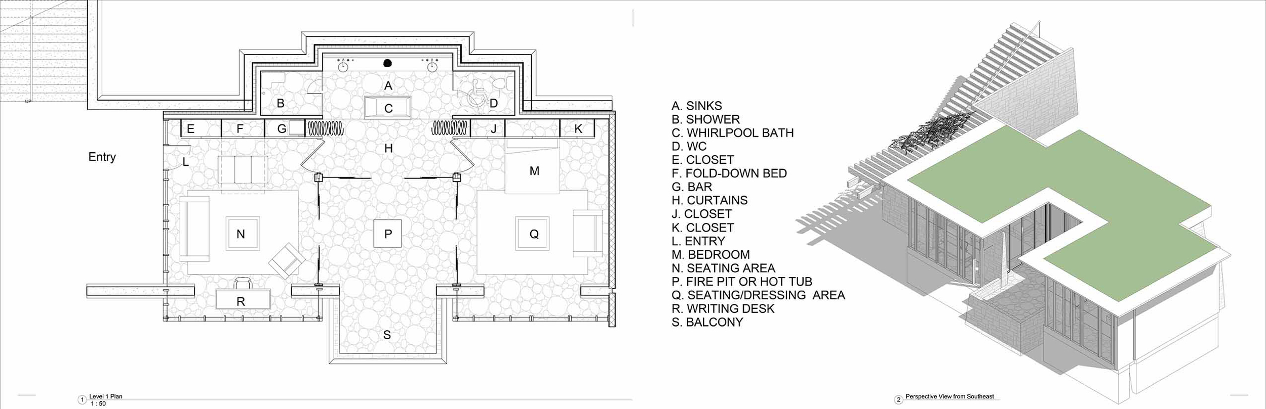
Overlooking these terraces, the main building, the lodge, started as a series of narrow volumes creating courtyards between them, and ended up as a doughnut surrounding a single courtyard punctuated by a tower or "utze" housing cafe and private apartments.

We presented our first design to the Ministry of Works and Human Settlements in December, with mixed results. Earth-covered buildings and our intention to build a garden and not a village, preserving the original buckwheat field, was met with understanding and approval. Inverted roofs, elliptical shed roofs, and modern skylights were rejected. 

We went back to the drawing board and completed our conceptual design a few months later.

Now we wait for project funding, hoping our design is powerful enough, persuasive enough, alluring enough to attract an investor.

case history: the desert home by roel krabbendam

case history: the desert home

3D View 10 warm.jpg

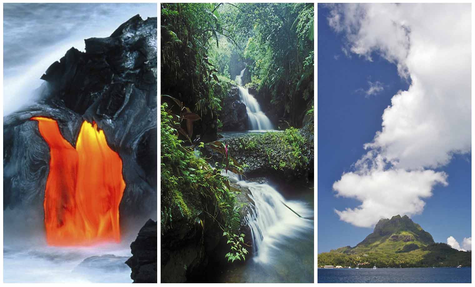
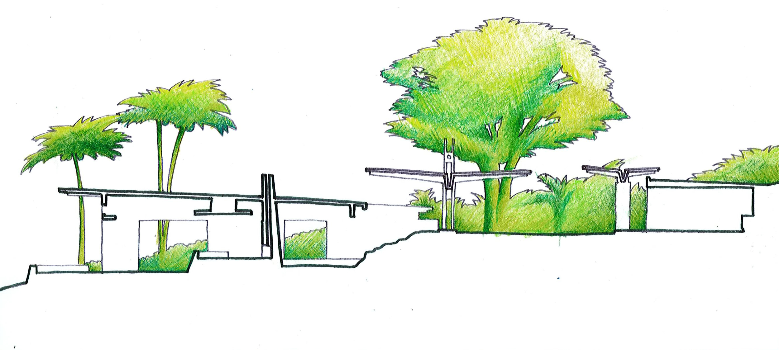
Our ideas about building in the desert come from three months spent crossing the Sahara Desert in 2006, and from 6 years now in the Sonoran Desert of Arizona.  From the Sahara, we got a visceral sense of the difference between building with earth and building with concrete.  The bottom line was this: In the absence especially of large quantities of expensive insulation, earthen construction was almost always comfortable, and concrete construction rarely so.  In the Sonoran Desert, we've come to draw inspiration from the creatures that operate comfortably in the environment, and extract typologies from that examination.  The house discussed here draws from the Desert Tortoise, relying on a tough, insulating shell to shield the more vulnerable living space within.

...a face only his mother could love...

...a face only his mother could love...

In this case, the shell is a reinforced thin-shell of concrete, covered by 14" of earth.  In this way we are able to benefit from the structural capacity of a modern material with the insulating value of earth.  Deep overhangs are calculated to admit sun during the winter, when the desert gets quite cold, and keep the sun out otherwise.  Liberal covered exterior space takes advantage of the opportunity to live outdoors for up to 6 months a year by providing shade.  Patios, driveways and the swimming pool extend out into the landscape, stabilizing the surrounding terrain.

The project is dug into a berm, taking advantage of underground temperatures that remain stable year-round between 50 and 60 degrees Fahrenheit.  Underneath the shell, the building is open to the breeze with a lot of surface area and large operable glass panels.

The question, especially with buildings that aren't cubic, is always what kind of urbanism would emerge if this were taken as a prototype.  In other words, what does a building like this mean for neighborhoods, and for cities?  The failures of suburbia: impoverished social structures, bland culture, enslavement to the car and to commuting, outsourcing childcare, all the gifts of Henry Ford and Frank Lloyd Wright and Dwight Eisenhower, they demand a better answer.  Our inspiration still comes from Paolo Soleri and Arcosanti and a vision of tremendous density and spatial diversity juxtaposed with great stretches of unabused land in its natural or cultivated state.

case history: a new school campus by roel krabbendam

case history: a new school campus

This is the story of a beautiful Sonoran Desert site adjacent to a wash flowing down from the Finger Rocks north of Tucson, Arizona, donated to the Tucson Waldorf School.

3605ERiver.jpg

The site floods, and large volumes of sand get deposited when it does, and the site is a protected landscape, a rural historic landscape certified by the Department of the Interior, meaning a huge swath of it facing the main road is highly scrutinized for adherence to an historic mythology.

WaldorfWSMasked.jpg

This beautiful 10 acre site was donated to the Tucson Waldorf School, and on it they envisioned building a new campus.  We were fortunate to become the designers.

Panorama south plot  facing north.jpg
Panorama south plot facing west copy.jpg
Panorama south plot facing south copy.jpg

We assembled a team for an integrated project delivery, including mechanical, electrical, plumbing, structural, civil, landscape and construction management consultants, and explored the project with the client in extensive charettes involving the entire school community. Discussions focused on sustainability and anthroposophy, a philosophy articulated by Rudolph Steiner in the early 20th century upon which the Waldorf system is based.  Regarding architecture, the philosophy emphasizes dialectics or juxtaposing opposites and eschews right angles, but a detailed explanation is impossible here.

charette panorama small.jpg

Early explorations of the site plan assumed entry to the site from the main road, placing parking and driveway in the protected landscape on the main road and pushing the school back away from the street noise.  An early metaphor about beehives and the anthroposophic injunction against right angles suggested a planning grid based on hexagons, which drove these early schemes.

Waldorf Site Plan 1.jpg

Ultimately however, the addition to the program of a soccer field forced a complete rethinking of the site plan, the soccer field could only go into the protected streetfront area, and entry to the site was moved back to the side street:

Waldorf Site Plan 2.jpg

The heart of this final conceptual site plan was the construction of four islands, one each for administration, early childhood, grades 1-8, and group functions (auditorium/gymnasium/support).  The islands would raise the buildings and play areas out of the floodplain, and would be connected with bridges to highlight their independence. Classrooms are pushed to the back, quieter part of the site, and the athletic and performance venue faces the main road.  We imagined school events this visible to the community driving by would be a tremendous calling card for the school.  The plan also articulated a three phase construction plan: Phase 1 in orange, Phase 2 in blue, and Phase 3 in pink.  With a site concept in place, we began schematic design of phase 1.

01 SITE PLAN.jpg

Our perception that in early childhood especially, children love to occupy corners suggested keeping the hexagonal rooms that were originally generic placeholders.  The hexagons were exceptional as rooms, and also wonderfully fluid in clusters, making this an important decision. They also avoided right angles, the anthroposophic concern nicely addressed.

06 EARLY CHILDHOOD FLOOR PLAN.jpg

 In the upper grades too, the hexagons allowed for straightforward orthogonal seating but offered apses for a teacher's desk and secondary activities.  Here we warped the hexagons in order to expand the teaching wall, and opened the rooms fully to the site behind the student seating to allow for connection without creating distraction.  Lockers and toilet facilities occupy the courtyard around which the Grades classrooms cluster.

09 GRADES FLOOR PLAN.jpg

The administration building proved quite straightforward, serving as an entry to the three other clusters and the site, maintaining a secure site entrance, and establishing a home base for the staff.

ADMIN PLAN.jpg

Three dimensionally, we experimented with a number of different building sections.  Our objectives were to provide a superior building envelope, maximize daylight, address anthroposophic concerns, and create a superior teaching environment.  Our experience in the Sahara Desert had proven the superiority of earth as a desert building medium, and rammed earth was our original intent.

rendered site section.jpg
building section 1 BW.jpg

Advice from the contractor regarding cost and constructibility led us to steel or wood frames with structural insulated panel (SIP) skins topped with stucco.  Extensive shading, sloped walls and columns to avoid right angles, and a subdued desert color palette were additional objectives.

West courtyard 2.jpg
east courtyard 2.jpg

Delivery of the schematic design package, consisting also of input from each consultant and a cost estimate from the contractor, was met with concern by the Grades teachers who were unconvinced by the hexagonal classrooms.  We produced an extensive comparison of different options, and decided ultimately as a group that the original design served them best.

At this point, key members of the Board of Directors left the project and the school, including most significantly, the head of the Board and key driver of the project.  The cost estimate came in very high, but there was no opportunity to explore construction options or scope changes that might bring the project in line. The new head of the Board had a very different vision for the school and another architect to carry it out.  A year later, the school built some modest classroom buildings that eliminated any possibility of our plan coming to fruition, and so we chalk this one up to experience and that realm of truly exceptional possibilities that will never be fulfilled.

case history: the branded environment by roel krabbendam

case history: the branded environment

We were approached by a Boston furniture dealer to help them think through the redesign of their showroom lobby, a mess of a space at the end of an anonymous corridor of a building filled with showrooms in a warehouse not far from downtown Boston.

cop.single.jpg

Our proposal centered on the red circle that featured so prominently in their logo.  We thought, "what could we do to turn that red circle into something more compelling, something that could draw people to the showroom down that long corridor from the elevators?", and we decided to turn it into a big red ball that would just sit there in the showroom without explanation.  We wanted a more compelling red, a more three dimensional red, and so the artist on the team came up with tissue paper and elmers glue:

red paper small.jpg

The layout proved pretty easy: remove everything cluttering up the space, and replace it with some lounge seating, a reception desk, and a way to show off the latest chair designs.  The design turned out like this:

COP Axon.jpg

It's true that we needed to blast light at that red wall to really make it come alive, and those lights didn't come cheap and so the final budget here wasn't zero.  For 6 years after the installation however, COP had an awesome entrance at the end of that long, public corridor, until the furniture company they represent required another rebranding.  When finally the red tissue paper and elmer's glue walls came down, we happily co-opted the material for our own logo, and we use it to this day.

Consult our portfolio for the final results of the Creative Office Pavilion showroom.

case history: the flexible, collaborative workplace by roel krabbendam

case history: the flexible, collaborative workplace

We were approached to design the new headquarters of Neustar Corporation, a spin-off from Lockheed Martin charged somehow with administering website domain names, a business that turns out to be very big business.  Like selling shovels to goldminers, we suspect this might be where the real money is.

We flew to Washington DC and were shown a dark cavern of space, a pancake wedged between neighboring buildings and filled with concrete columns every 20 feet in all directions.  We had been imagining empty loft space on the trip over, and felt like we'd accidentally stumbled into the parking garage instead.  The space was...challenging...

ParkingGarage.jpg

We asked Neustar if they could get out of the lease, but no dice.

Back at the studio some time later, committed to the project, and programming complete, but not yet struck by thunderbolts of inspiration, we simply started with test fits.  The existing floorplate was a sea of columns with an elevator core stuck in the middle:

Floorplate Plan.jpg

We had the company broken down by department and personnel count, we understood the flat hierarchy, we had heard their commitment to collaboration and fluid teams, but we didn't yet understand possible layouts that worked with the unusual floor plate and limited access to daylight and views.  The test fit result was a horrifying rat's maze:

Test Plan Sketch.jpg

One of us remembered a night from his youth, north of Agadir, Morrocco, with an inky black sky above and dozens of bonfires lit along the beach, groups of people gathered around each, carousing and playing music, ...and we might have rolled our eyes at yet another story from 1979 except that it captured exactly the experience of being in that deep, dark space down in Washington, and it captured the possibility of some kind of beacons scattered around the floorplate that would serve perhaps as departmental hubs, cutting the darkness.

A new plan emerged, now with each department centered on a conference room, a glowing totem of a room, a room that started off as a bonfire but became more like a lit beacon or lighthouse, crossed with an idea about grafitti and Paris kiosks filled with announcements that led to us adding erasable whiteboard to the rooms both inside and out, a place where people could gather in ad hoc ways and doodle or brainstorm:

Final Plan Sketch.jpg

This new plan imagined workstations spreading throughout the floor organically, growing and shrinking like a bacteria or a virus throughout the rigid matrix of the floorplate.  It was a conception made possible by a new hexagonal workstation design developed by Herman Miller, that abandoned the orthogonal limitations of traditional furniture systems.  This new furniture system was radically light and open, dispensing with tired concerns about privacy or hierarchy and embracing teamwork and visual connection.  This felt like the way work should happen in order to fuel creativity.

We could imagine now, a floor filled with glowing totems:

Neustar Glowing Rooms.jpg

With encouragement from the client, we developed the design further.  The conference rooms in particular required careful consideration, serving now as beacons, kiosks, meeting rooms, and presentation venues:

Neustar Conference Room.jpg

The resulting workspace proved radical: combining density with flexibility, juxtaposing the stationary with the fluid, encouraging collaboration with the whiteboard kiosks, identifying departments with the beacons and creating an unbridled atmosphere of creative freedom.  There was resistance certainly, fiercely, as no client like this is monolithic, but we had captured the imagination of the CEO with our vision of his company, and this is perhaps the only reason this project survived: just this one man and his sense of possibility.  We recall Buckminster Fuller, who famously dealt only with the very top of the organizations for whom he worked, anything else in his estimation a complete waste of time.  The problems we solve, the architecture we commit ourselves too: they aren't flashy or particularly fashionable usually,  We wring meaning from them however, and bestow nothing less than careful attention and yes, love, and this is how we feed our own hope that tomorrow is even more exceptional than today.  Hope, Love, Meaning.

See our portfolio for photographs of the final results.

case history: the tropical home by roel krabbendam

case history: the tropical home

A friend called from Hawai'i to ask if we knew any architects who could design a house for his new coffee plantation.  We suggested he hire us for the job, and flew out to take a look at his site.  It was early autumn in Boston, the heat and humidity gone, a trip to Hawai'i just the thing to prolong summer.

The flight to the Big Island of Hawai'i was long, first to Los Angeles and then over an ocean as rippled and green grey as slate.  The sun sank away, reading was futile, and the movie was boring: emerging finally from the plane felt like crawling out of an underground hole.  It was warm and dark and moist in Kona, and the lei offered in welcome smelled absolutely delicious.

The next morning, this more or less is what we saw of the site.  

The client insisted there was a fantastic view there, of miles of coastline and an ocean all the way to Japan.

Here's something that turned out to be the most important thing our client showed us: a closet that didn't get any fresh air:

Without excellent ventilation, the moisture here settles everywhere, and the black mold rapidly follows.  The lesson is simple: the free flow of air is absolutely imperative in this place.  It started us thinking about flow.

lava water air.jpg

In Hawai'i, the ground, the air, the water...it all flows.  It's neither theoretical nor dull enough to ignore.  It is visceral, and commonplace and it makes the experience of being there more vibrant than elsewhere.  It is exactly what makes this place...this place: its genius loci.  We determined that this house, to be truly and fully of this place, it would be about flow.

In thinking about flow, we realized the flow of air and water and lava was really either mauka: up the hill, or makai: towards the ocean.  Obvious perhaps, but out of this thought came the image of an array of parallel walls perpendicular to the slope, a configuration least disruptive of the flow.  These parallel walls could hold up the roof and provide separation between spaces, but never create the moldy closet we saw when we first arrived in Kona.

There are lots of examples of parallel wall buildings, but the one that inspired us here is the Sonsbeek Pavilion designed in 1966 by the Dutch architect Aldo van Eyck and rebuilt in 2006 (It was a temporary sculpture exhibit).

van-eyck-05.jpg

We love the way the parallel walls grapple with roundness, and the way views and spatial relationships are enriched with unexpected openings.

tumblr_mi4fflfM4d1qeerxjo1_1280.jpg

This image from the original structure beautifully highlights the contrast between the dark sculptures and the light walls, the heavy concrete block and the light roof structure, sun and shade.  In the same way straight slots of space become round apses, the play of opposites makes a rich architectural experience.  Here is the rebuilt structure:

Screenshot 2014-02-19 11.39.46.jpg

We worked through the Fall and Winter on the house, The idea of parallel walls came early, but a convincing building eluded us.  Another client needed our help in New York City, and in some little cafe in the Village came the idea to break the Hawai'i house into 6 pieces: Master Bedroom, Office, Living Room, Kitchen/Dining Room, Guest Bedrooms and Garage,  Open Lanais could occupy the spaces between these elements under a great big green copper roof.

The Van Eyck building niggled at us, his way of mashing round and straight in particular suggesting to us that straight walls alone would lack even the slightest possibility of spatial tension.  A crude sketch of the Hawai'i plan, great big red magic marker ellipses highlighting what we started calling "hot spots", fireplace, kitchen, master bedroom, suggested some possibilities.  The ellipses ultimately erupted out of the roof, great big skylights implying space below without rippling the walls.

plan ovals.jpg

In early Spring we flew back to Hawai'i, a month lost to quibbles with the client about the kitchen/dining room.  It seemed the only way to bust through the impasse.  For a week we sketched options, the client reviewing them every evening, until finally a front kitchen with a huge surf board of an island and a back kitchen with dishwashing and storage solved the problem.  A huge snowstorm in Boston kept us in Hawai'i an extra day, and we could celebrate a problem solved.

We sent a model off to Hawai'i, a big chipboard affair.  The response was positive.  We changed our mind about the garage, begging to amputate it from the house and shove it into the slope behind the house.  We spent more time than we were paid for.  Our plan for Hula Dog Farm developed into this:

plan.jpg

The pools of water flow through the house, clouds can drift through, and the lava rock and plants flow into the dwelling as well.  Views out into the landscape in all directions ties you directly, viscerally to the landscape.  A section through the building shows this as well:

section c.jpg

We thought a lot about air flow and cooling, accounting for evaporation and the bernoulli principle and every other strategy we could think of that might keep air moving in the building:

Hula Dog Section 1a.jpg
Hula Dog Section 1b.jpg

...and when we were done, and the building we designed was built, and the owner called to say that clouds were drifting through his house, we could email him this picture torn out of a travel magazine on the plane flight home from our first site visit, before we really knew what we were going to do:

CCF05292013_00000.jpg

A few years later, after the house was "discovered", a photographer asked to document the house, and it came to anchor a book called "The Hawai'ian House Now".  It's available through Amazon.

51113UGipzL.jpg

There are parts of this story less triumphant: how the client lived in a shipping container for two years on the site to get this thing built, how it took him a year to find a contractor to build it for the money he could borrow, how we almost lost the skylights and the beautiful pool to the pressure to reduce cost, how the contractors that finally started despite skills and endurance failed to finish and lost their own houses to the bonding company, their bid price too low, how the soils on the site gave way in the rains one night.  These were all emergencies then but feel like footnotes now.

The original owner still lives there, and just this year we designed some support buildings to help him more effectively operate the coffee plantation.  See our portfolio for photographs of the house.