
finding your visual voice /
finding your visual voice

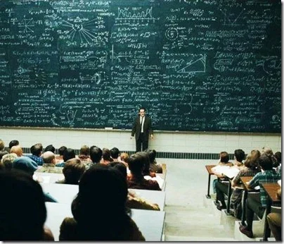
In this edition of the "On Purpose" radio program, Polly Dithmer discusses her own background, developing the Visual Voice program, and what small business needs to do to find their voice and be heard in a noisy marketplace. What does it take to define your value and purpose, to identify your ideal client, and to convey your message succinctly and powerfully? What does it take to be heard?
Listen to the program here:
persuasion /
persuasion
Did you follow that line of reasoning?
How do you communicate and convince others with your point of view? Unsurprisingly perhaps, it turns out that stories are more engaging and persuasive than facts: they engage both the emotions and the intellect to provide a mental framework that keeps on working long after you've stopped talking. A study done at Carnegie Mellon University in 2007 by Deborah Small, George Lowenstein and Paul Slovic concluded two things: personal stories about identifiable people make a case far more compellingly than depersonalized statistics, and personal stories are often more compelling than stories plus statistics, especially when those facts blunt the impact of the story.
Why then does your website rely on facts and not stories? Lots of reasons: not enough space, too many words, undefined audience...but most likely, a mindset focused on the mission and not the audience. If you stop to consider who you serve, elicit personal and evocative narratives showing your impact, and convey that impact visually and viscerally as a story, then you stand a better chance of conveying a convincing message.
Department of appropriate attribution: "Sympathy and Callousness: The Impact of Deliberative Thought on Donations to Identifiable and Statistical Victims," Deborah A. Small, George Loewenstein, Paul Slovic; Organizational Behavior and Human Decision Processes, March 2007.
diy tip: color matching /
diy tip: color matching

You've found an image that persuasively communicates your brand, and now you want to build a website around it. Here's how you extract the color palette from that image so that you can build frames, backgrounds and text that matches (cut and paste the link into your browser after you read this):
http://www.colourlovers.com/photocopa
You'll have to sign up to the site in order to use the tool, but this involves no more than establishing a user name and password. Once you're signed up, navigate to the "photocopa" page, click "photo" (just under "publish" at the top right), and type in the url of the image you want to use. You instantly get a range of colors found in the image, expressed as small samples to the right on your screen. Pick on various samples or on the image itself to create a palette at the bottom left. Clicking a small icon at the top right of each palette swatch gives you the Hex, RGB and HSV codes.
If you ever wondered how graphic designers matched color, there's your answer.
case history: naia healing arts /
case history: naia healing arts

This sole proprietor sheepishly admitted during the Visual Voice interviews that she had some artwork in a drawer that meant a lot to her, but that she had never thought of as a brand identifier and that probably wasn't serviceable due to the quality of the rendition. Probing deeper, we came to understand just how much this client identified with that work, and how empowering it was to her even to imagine using it.
The quality of the images were, in fact, very difficult to adapt to electronic media. Ultimately, after getting client approval of sketches for the work, we recreated the images entirely. The key to this story was the recognition, through the Visual Voice interviews, that the art existed, and that it was a full expression of our client and her purpose: that she felt incredibly empowered by our elevation of the work to an expression of her brand.
What empowers you? What might give you the confidence and project the authority to rock your business?
This is what the proprietor of Naia Healing Arts had to say about the Visual Voice program:
“I help people heal their chronic pain by tapping into their Inner Joy. I help them expand into the person they want to be, and in so doing, their health improves, every time. I struggled with how to represent this as an image, and so for years I used a picture of a dolphin, since dolphins represent joy for me. But in my conversations with Polly, it became clear that I needed to take my own advice :) I needed to express my own Inner Joy in my business card, as it is my visual voice. So I took my artwork out of safe-keeping, and put it on my promotional materials for all to see. The process has been tremendously healing, and the outcome is stunning.”
Claire Elisabeth
Naia Healing Arts
fun fact: design makes a difference /
fun fact: design makes a difference
We met Susan Kirby at a conference and designed a business card for her. She felt so inspired and empowered by it that she sold thousands of dollars of services the day after the cards arrived in the mail. That's the power of the Visual Voice, and the value of Smart, Empowering Design.
Department of CYA: Not all clients will experience immediate results of this magnitude, but we'll do everything we can to help you get there.
Look at your collateral. Look at your website. Can you imagine them inspiring you and your staff? Can you imagine feeling so fully self-expressed by your materials that the pride inspires your clients?
diy tip: typography /
diy tip: typography
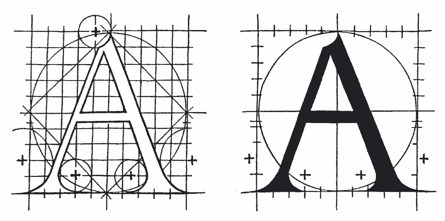
So...the thought of hiring a graphic designer drives you crazy, but you need to figure out what typefaces to use for your brand identity. Typefaces add the emotion and individuality to what we say in print. If you're at the point of choosing fonts, you've hopefully already defined your brand personality. Your typeface will want to align with and evoke that personality.
Here's one simple (sort of) 5 step approach to selecting a typeface:
First, define your utilization.
2 basic uses for type:
a. headers and titles and slogans that are typically shorter, larger and convey lots of personality
b. body text that offers explanation or detail, and is usually smaller & may come in high volumes
Second, define your category or classification of type. Here's one approach:
a. sans serif (straightforward, no squiggles, easy to read at small sizes, great for body text).
a1. Geometric (pure geometric forms, colder, more precise)
examples: Helvetica, Univers, Futura, Avante Garde, Akzidenz Grotesk, Franklin Gothic, Gotham
a2. Humanist (just enough subtle tuning to feel man-made instead of machine-generated)
examples: Gill Sans, Frutiger, Myriad, Optima, Verdana
b. serif (oozing personality, plenty of flourishes, most suited for headers/titles/slogans)
b1. Old Style (classic forms often referencing calligraphy)
examples: Jenson, Bembo, Palatino, Garamond
b2. Transitional and Modern (mid to late 1800s: sharper, more geometric)
examples: Times New Roman, Baskerville, Bodoni, Didot
b3. Slab (Simple forms wearing heavy shoes)
examples: Rockwell, Clarendon, Memphis
Third, find your typeface.
a. If your medium is primarily or exclusively electronic, and you are very concerned with retaining the integrity of your design when viewed by web browsers, consider restricting your typeface selection to websafe fonts: arial, comic sans, courier new, georgia, impact, palatino,
tahoma, times new roman, trebuchet ms, verdana
b. if you are comfortable with having some computers substitute other typefaces for those you select, or if you present everything design-sensitive as an image instead of as type, or if your medium is not primarily electronic, then consider the following approaches to selection:
1. If you are restricting your search to typefaces loaded on your computer, go to wordmark.it.
1a. Load your computer's typefaces into the program as instructed.
1b. Where it says "Wordmark", type in the title or phrase you want to use.
Below, you will see your phrase depicted in every typeface you have on your computer, ready for your selection. There are additional controls on the menu bar to modify appearances.
2. If a larger world of typeface possibilities are of interest, do a websearch for "fonts". There is a very large universe of foundries and markets for fonts you can purchase, and there is a very large field of free fonts not necessarily optimized for all uses or available for commercial use, but oozing with personality. Remember: define your brand personality, and stay aligned with it.
3. If you have seen a font and want to know what it is, go to http://www.myfonts.com/WhatTheFont/ and load the electronic image for identification.
Fourth, verify that your selection serves your purposes effectively:
a. Is the typeface available in the sizes you need?
b. Is the typeface available in the styles you need (italic, bold, condensed etc.)?
c. Does the typeface offer all of the characters that you need (ligatures for example)?
d. Does the typeface support the alphabets and languages you need (letters, diacritics)?
e. Does the typeface read fluidly and comfortably if you are using it for body text?
f. Does the typeface align with your brand personality if used for title text?
Fifth, contact us. It's optional of course, but we're happy to share our thoughts, and we might just save you from yourself. Go to the Contact page on the website.
For another take on selecting typefaces, try http://julianhansen.com/. Julian has a neat flowchart for sale that leads you through a decision tree to a typeface selection. Still cheaper than hiring a designer!
case history: peggy scott /
case history: peggy scott
A client from the San Francisco Bay area approached us for assistance with her brand. The Visual Voice interviews immediately identified a problem: precision in defining a mission and ideal client was missing. The depth and experience of Peggy Scott as a business was sufficiently vast that narrowing the focus seemed counterintuitive, yet this was our advice in order for the company to find new traction. We assisted the organization in defining their focus, then assembled an image search based on key words from the Visual Voice interviews. A few of the hundreds of images assembled:

Peggy Scott consults to public personalities, professionals and companies with an executive stratum in order improve effectiveness in presenting and communicating their message. Peggy Scott clients undergo targeted training in defining their purpose and their message, in refining their presentation skills and in polishing their manner and appearance.
Key words like "honing", "sharpening" and "simplifying" identified in the Visual Voice interviews led us to a thinly etched sans serif typeface, Avenir. We recommended eliminating the original word "Enterprises" used after the company name, presenting it more straightforwardly as "Peggy Scott". The executive clientele suggested a deep royal blue color to us, and the focus among other issues, on polishing appearances suggested a background of fabric. Of course our thinking was not this linear, and we experimented with numerous options both in the office and with the client, but the successful result came from that simple thought process.

That's what we thought anyway. Just after the proofs arrived from the printer, we found the company using another option in some secondary collateral and discovered that they actually found that version more inspiring. They thought it was too late to voice second thoughts. The brand would have been split in two and the power of a consistent brand diminished or even lost had the error not come to light in time. We're glad it did come to light:

diy tip: color /
diy tip: color
Josef Albers, an artist and teacher who came out of the Bauhaus, published a book in 1963 "Interaction of Color", in which he showed how perception is shaped by both object and context. Color, for example is perceived differently, depending on the background.

Homage to the Square, 1965
What does it mean to us in branding and graphic design? We suggest you never pick a color in isolation: always pick them in pairs (foreground/background for example), or pick them conscious of the context in which they will be seen...even if that context is a white page. Color changes depending on the context.

diy tip: naming your business /
diy tip: naming your business

How do you name your business? The two most important criteria for most businesses are:
1. Can you get secure a domain name for your website?
2. Can you successfully incorporate in your State?
Since you compete nationally or internationally for domain names, and only compete within your own state and business type for incorporation, we suggest you start with your domain name. We go to Godaddy.com because it's convenient, and type in possible domain names until we run out of ideas, noting prices and availability as we go along. Then we go to the state for incorporation. When we find a match we like, we have our company name.
The image above shows the brainstorming for our own company. We wanted to build a business that wasn't tied to the founders names in order to facilitate succession in the future, and pursued a number of themes related to design: shapes, colors, imagination, inspiration, architecture, interior design, graphic design, ideas, invention....200-250 options, many of them goofy non-starters, and 3 or 4 hours of work, quite a bit more to complete the incorporation and secure the domain.
Most simple and straightforward domain names have long ago been secured by others. A few strategies to consider:
1. Juxtapose two independent ideas that relate to your business, for a unique mashup.
2. Include your name.
3. Latinize: Go to http://www.quizopolis.com/latin-name-generator.php and type in anything for a pseudo-latin translation. We don't know latin: maybe this is real.
4. Go to Google Translate and have fun: imagine RED in Indonesian is bayangkan merah. Pretty sure the domain name is available.
As with every element of your brand, each one is an opportunity to distinguish yourself from the competition. As one of the most basic elements of your brand, and a decision you'll hopefully be living with for a very long time, getting your name right is worth the effort.
tools: brand personality /
tools: brand personality
Considering your brand personality, and taking charge of it, can be an important differentiating tool, especially if you deliver a common commodity or service. In a large field of real estate agents for example, the WAY you deliver your service, and what you CONVEY about your service, may be the only distinction attracting customers to you. Defining your brand personality, and then aligning everything that conveys your brand with this conception, is a powerful way to build brand recognition and loyalty. We like this succinct explanation of brand personality (cut and paste into your browser):
http://www.slideshare.net/sjhus/brand-personality-presentation
Here is a list of dialectics to help you define your own brand personality: Are you...
Humorous or Severe?
Expansive or Subtle?
Delicate or Strident?
Precise or Fluid?
Organized or Ad Hoc?
Machined or Handmade?
Neat or Messy?
Male or Female?
Progressive or Nostalgic?
Functional or Decorative?
Simple or Complex?
Geometric or Organic?
Plain or Fancy?
Trendy or Status Quo?
Youthful or Mature?
Ghandi or Sun Tzu?
You may ask yourself:
If you or your business were a plant, what plant would that be? Why?
If you or your business were an animal, what animal would that be? Why?
If you or your business were a car, what car would that be? Why?
Define your Brand Personality, and let it color your message and your collateral.
fun facts: color, and why it matters /
fun facts: color, and why it matters
The good people at colorcom.com offer these little tidbits:
1. Color alone increases brand recognition by up to 80%.
(Pick good colors people)!
2. People judge people, environments and products within 90 seconds of initial viewing. Between 62% and 90% of that assessment is based on color alone?
(You have to wonder where they get these facts: turns out its surveys)
3. 84.7% of survey respondents stated color accounts for more than half among factors important to choosing products.
source:www.colorcom.com/research/why-color-matters
tools: typefaces /
tools: typefaces
The vast, vast ocean of available typefaces may be daunting, so here is a rather nicely presented alternative: the periodic table of typefaces. It covers the basic categories, offers representative fonts, and for those who see typeface selection as more of an impediment than an opportunity, may be just the tiny, tidy tidepool of options to move the decision-making along.
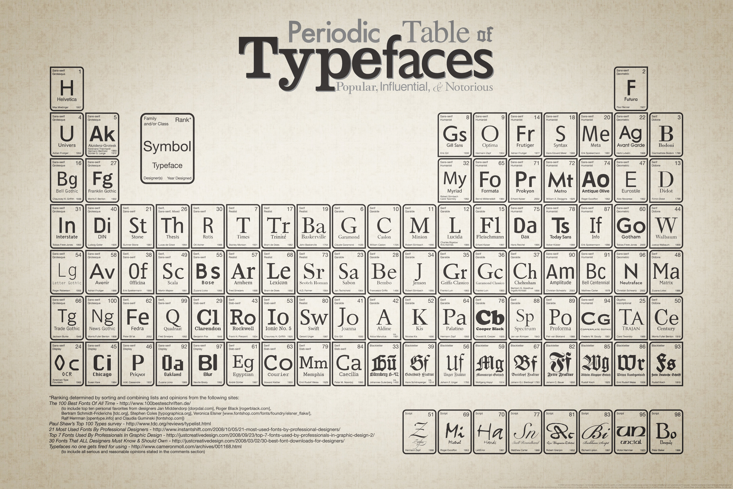
department of appropriate attribution: cam wilde, squidspot.com
case history: practical body logic /
case history: practical body logic
Our client asked us simply for a website header based on a reduced program of interviews, and because we already had some sense of them and their project, thought we might yet succeed.
Practical Body Logic sought to empower handicapped children to embrace a sense of unlimited possibility despite their particular circumstances. What story could this header tell? We grappled with cliches (don't judge a book by its cover), we danced with the saccharine (cheerful children), and we flirted with minimalism (text on tone only...but evocative...) though only out of desperation, until we found a photo of the rainbow eucalyptus and knew immediately that we need look no further.

This story: that behind every possible color and imperfection of exterior lay the same perfect organism with the same unlimited possibilities for growth and development, that story seemed conveyed here with both precision and visceral beauty.
tools: color /
tools: color
There is so much emotion and meaning invested in color and it is unquestionably a powerful component of brand identity. As our case histories show, we often select color based on associations, not specifically on potential "meanings", yet those meanings are something to consider nonetheless and keep in mind in a selection. The global color survey takes a stab at identifying those meanings, asking you for your color associations before showing you the results of their continuing inquiry (cut and paste into your browser to pay a visit):
www.colormatters.com/color-symbolism/global-color-survey
With only 20 or so colors and associations, the approach might be a bit reductionist, but on the possibly complex road to a color selection, not a bad place to start.
Another place to find meanings associated with color: Art Therapy
http://www.arttherapyblog.com/resources/color-meanings-symbolism-charts/#.UwutcvldV8H
Neat word clouds with footnotes for divergent international meanings distinguish this website.

The Visual Voice approach relies as much on association as on emotion. We ask for colors and images that speak to our clients to start, independent of context, but then rely on our own associations and creative thinking to generate options. Sometimes an image or photograph will speak to us, and color becomes a byproduct of that selection rather than a focus in itself.
We always discuss both meaning and association in helping our clients choose among the options we present, but ultimately, here's what counts: is the brand identity appropriate, is it meaningful, is it visceral and evocative, and does the client feel empowered by it?
tools: typography /
tools: typography
A resource for you do-it-yourselfers out there: Typedia.com
One of the decisions you make in creating an identity is what typeface to use. This is one place you can go to learn what's out there, what makes up a font, how they are composed, how they are classified, who designs them and who produces them.
One approach is to hit "explore", view "by classification", choose a class like "sans serif", and view an encyclopedia of possibilities. Bewildered by the vast array of possibilities? Start with this brief tutorial from Dan Mayer, who teaches this stuff (you'll need to copy and paste it into your browser):
http://www.smashingmagazine.com/2010/12/14/what-font-should-i-use-five-principles-for-choosing-and-using-typefaces/
One last thing to consider, if you are planning any digital communication at all: Apples and PCs are loaded with different typefaces, with very few overlaps. When you consider mobile technology, there are even fewer. Those overlaps are called websafe fonts, and they are the only fonts that will display exactly as designed on all web browsers. If you care a lot about your design, stick to websafe fonts. If you're flexible, at least include CSS code specifying font family alternatives and categories so that the basic intent of your design remains intact.
websafe fonts:
arial, comic sans, courier new, georgia, impact, palatino,
tahoma, times new roman, trebuchet ms, verdana
case history: tennis to the max /
case history: tennis to the max
How to communicate the energy and depth of what Tina Greenbaum and Fred Sperber do with their tennis players? Their venture, Tennis to the Max, capitalizes on Tina's psychology background and Fred's tennis career to focus students on their mental game. The psychology of what happens on the tennis court, especially when the stakes are high, is an issue much discussed by players, but rarely addressed specifically and rigorously by tennis coaches. It is a kind of shadow game, what players think and the impact that has on the game, and this image of shadows was what gave us the clue to finding Tina and Fred's Visual Voice.

We began with a logo design, text only since imagery was to come, and played with a somewhat heroic stance, the shadows strong and the letters popping off the page. It seemed to capture both the energy of the game and that unspoken psychological aspects on which Tennis to the Max focuses. Wide white tennis court stripes informed our thinking as well.

As we focused on web design, color required our first attentions. Looking at local tennis courts, remembering courts from our past, and pulling imagery from the web, we were surprised by the range of colors they come in. More than we expected, but less than a dozen in any case: just right for a palette to serve our purposes.

A web search was sufficient to find our imagery, the stock photo shops full of high quality material. We rotated the photos to create dynamic diagonals, and cropped out the player's faces to focus on their shadows, creating finally a host of website headers in addition to the printed pieces.

Here's what our client thought:
"Roel, and his partner Polly are a remarkable duet. I hired them to build a creative website for me and they really delivered (www.tennistothemax.com). What I loved about working with them is they were one-stop shopping. From concept, to copy writing, to technical savvy, they were there to hold my hand and walk me through a very complicated process. I truly felt "they had my back." I would highly recommend imagine RED to anyone wanting a superior product."
fun facts: visual communication /
fun facts: visual communication
Some facts from a study quantifying the impact of the internet on how we communicate:

Attention Span, Statistics and Data
The average attention span in 2000: 12 seconds
The average attention span in 2013: 8 seconds
The average attention span of a gold fish: 9 seconds
(Our average attention span is less than a goldfish?!?)
Percent of teens who forget major details of close friends and relatives: 25 %
Percent of people who forget their own birthdays from time to time: 7 %
Average number of times per hour an office worker checks their email inbox: 30
Average length watched of a single internet video: 2.7 minutes
Internet Browsing Statistics (Taken from 59,573 page views)
Percent of page views that last less than 4 seconds: 17 %
Percent of page views that lasted more than 10 minutes: 4 %
Percent of words read on web pages with 111 words or less: 49 %
Percent of words read on an average (593 words) web page: 28 %
Users spend only 4.4 seconds more for each additional 100 words
Source: Harald Weinreich, Hartmut Obendorf, Eelco Herder, and Matthias Mayer: “Not Quite the Average: An Empirical Study of Web Use,” in the ACM Transactions on the Web, vol. 2, no. 1 (February 2008), article #5.